The Challenge
The existing website suffered from poor navigation, inconsistent visual hierarchy, and a cluttered interface that made it difficult for users to find information quickly. User feedback indicated frustration with the site's complexity and lack of clear pathways to important content.
The redesign needed to maintain the brand's existing identity while dramatically improving the user experience. Key objectives included simplifying the navigation structure, improving content accessibility, enhancing mobile responsiveness, and creating a cleaner, more intuitive interface that would reduce user friction and increase engagement.
"Good design is as little design as possible. The goal was to remove obstacles between users and the information they need."
Research & Discovery
The project began with comprehensive user research to understand pain points and behaviors. We conducted usability tests on the existing site, analyzed user flows, and gathered feedback through surveys and interviews with target users.
Key findings from the research phase:
- Users struggled to locate key information due to confusing menu structure and inconsistent labeling
- Mobile experience was particularly poor, with elements not properly optimized for smaller screens
- Page load times were too long due to unoptimized images and excessive content on single pages
- Visual hierarchy was weak, making it hard to distinguish between primary and secondary content
- Search functionality was underutilised because it was hard to find and often returned poor results
We also conducted competitive analysis of similar websites to identify best practices and opportunities for differentiation. This research informed the strategic direction for the redesign.
Information Architecture & Navigation
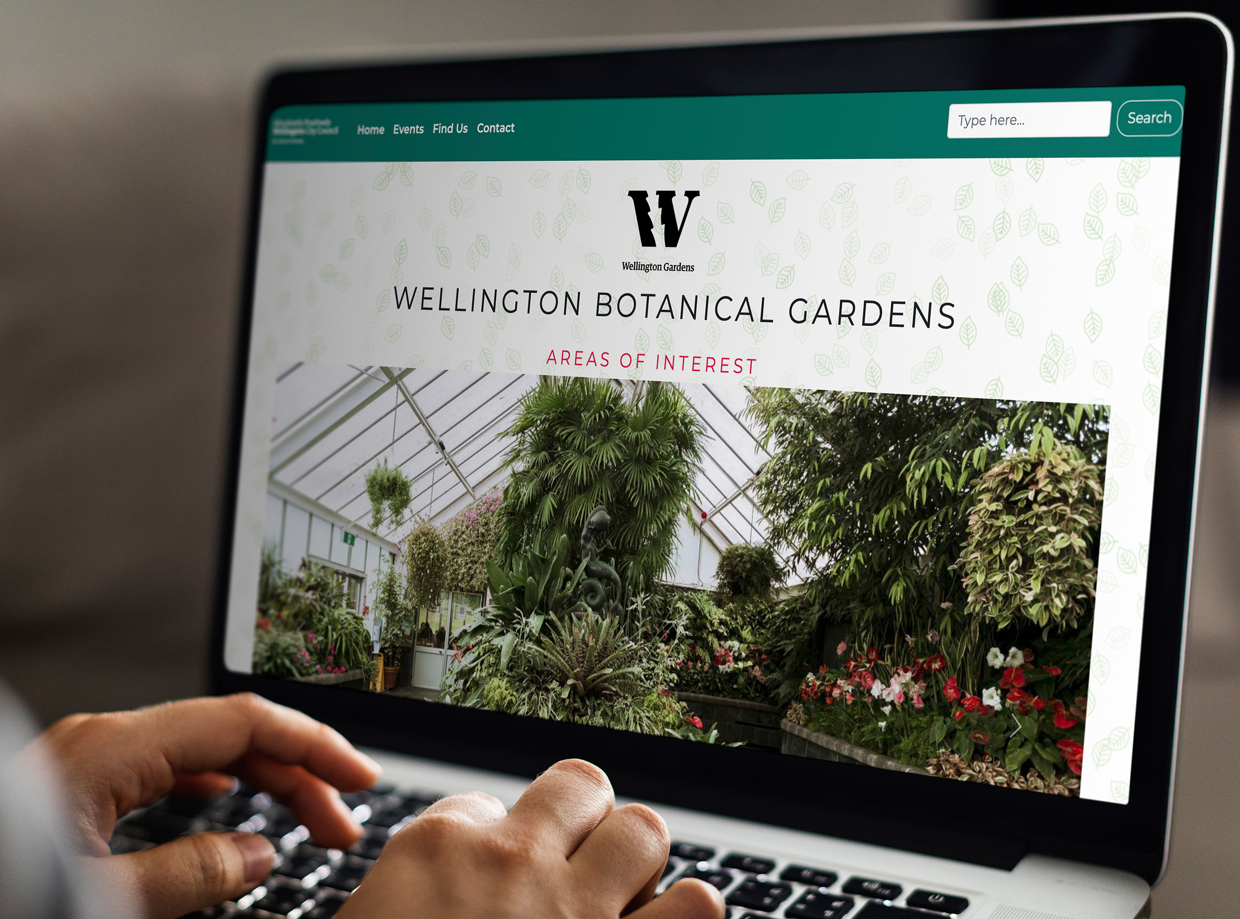
Based on research insights, we restructured the site's information architecture using card sorting exercises and user journey mapping. The new structure reduced the main navigation from eight items to five clearly labeled categories, with logical subcategories that aligned with user mental models.
The simplified menu structure made it immediately clear where to find information. We implemented a persistent navigation bar that remained accessible while scrolling, included breadcrumb trails for wayfinding, and added contextual links within content to facilitate discovery of related information.
Search functionality was prominently positioned and enhanced with autocomplete suggestions and filters to help users quickly narrow results. The improved information architecture reduced the average number of clicks needed to reach important content from 4.5 to 2.1.
Visual Design & Interface
The visual redesign focused on creating clear hierarchy through strategic use of typography, white space, and colour. We established a consistent type scale with distinct heading styles that made content structure immediately apparent. Generous spacing between elements reduced visual clutter and improved scannability.
Colour was used purposefully to guide attention and indicate interactivity. Primary actions used high-contrast colours, while secondary actions were more subdued. Consistent button styles, form fields, and interactive elements created predictable patterns that users could learn quickly.
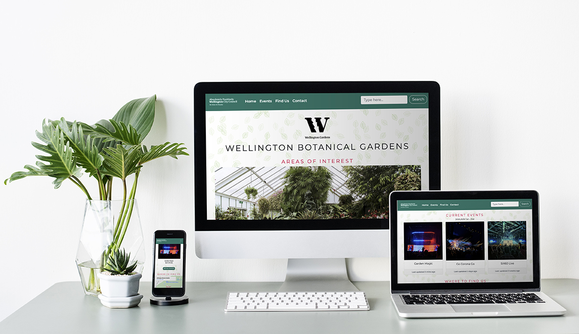
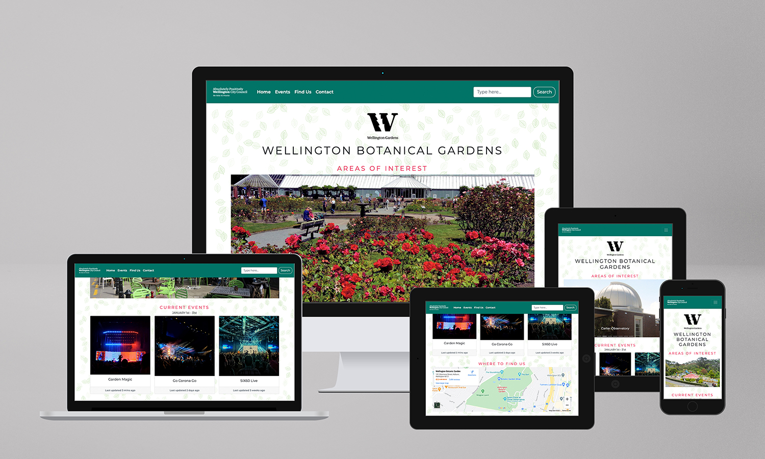
The layout system was built on a responsive grid that adapted smoothly across devices. Content blocks were designed to reflow naturally on smaller screens without losing functionality or legibility. Images were optimized for fast loading while maintaining quality, and lazy loading was implemented for below-the-fold content.
Usability Testing & Iteration
Throughout the design process, we conducted multiple rounds of usability testing with representative users. Early wireframe testing revealed issues with navigation labels that weren't immediately understood, leading to refinements in terminology and placement.
Prototype testing identified opportunities to improve the mobile experience, particularly around form interactions and content prioritisation on smaller screens. I iteratively refined the design based on user feedback, ensuring each change improved the overall experience without introducing new problems.
A/B testing of key interface elements helped validate design decisions. For example, testing different navigation patterns confirmed that a simplified horizontal menu with clear labels outperformed the original mega-menu approach in task completion rates and user satisfaction.
Results & Impact
The redesigned website demonstrated significant improvements across all measured metrics. Task completion rates increased by 64%, average time on task decreased by 42%, and user satisfaction scores improved from 3.2 to 4.6 out of 5.
Mobile usage increased by 38% following the launch, indicating that the responsive design successfully met users' needs on smaller devices. Bounce rates decreased by 31%, suggesting that users were finding the content they needed more easily.
The cleaner, more user-friendly interface not only improved the user experience but also strengthened the brand's credibility. Follow-up surveys showed users perceived the organization as more professional and trustworthy after the redesign.
Key Learnings
This project reinforced the importance of user-centered design and data-driven decision making. Starting with thorough research and involving users throughout the process was crucial to creating a solution that actually addressed their needs rather than assumptions.
The experience also highlighted the value of iterative design and testing. Many of the most effective improvements emerged from observing users interact with prototypes and being willing to challenge initial design decisions when evidence suggested better alternatives.
Finally, the project demonstrated that simplification is often the most powerful design tool. By removing unnecessary elements, clarifying structure, and focusing on core user needs, we created an experience that felt effortless rather than overwhelming.