The Challenge
The New Zealand Cricket Museum faced a significant challenge: while the museum celebrated cricket's rich history, it struggled to attract female visitors, particularly those interested in women's cricket. With the ICC Women's Cricket World Cup 2021 approaching and New Zealand serving as host nation, there was a unique opportunity to increase female engagement.
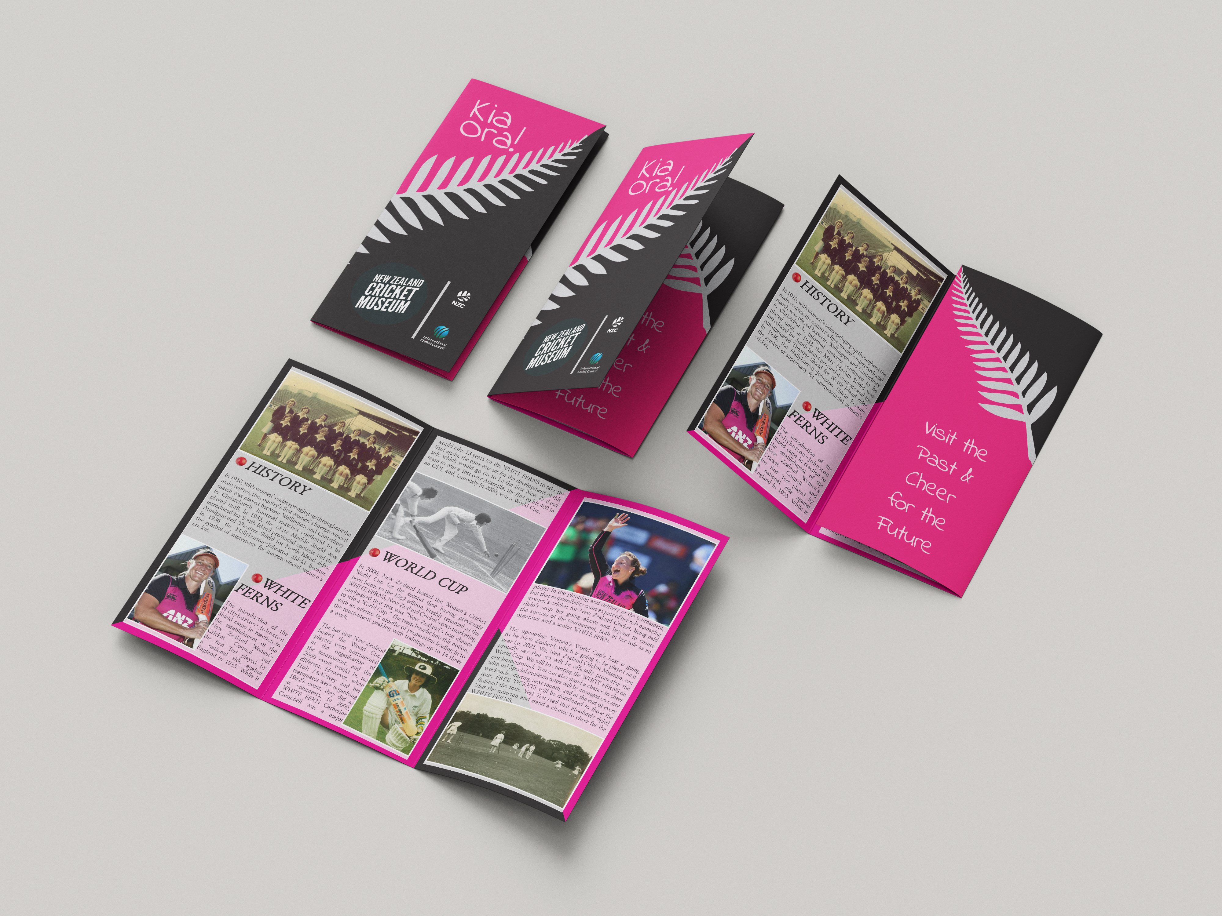
The project required creating an informational brochure that would serve multiple purposes: educating visitors about the often-overlooked history of women's cricket in New Zealand, promoting the museum as a destination for female cricket fans, and generating excitement for the upcoming World Cup. The design needed to be accessible, engaging, and informative while challenging traditional perceptions of cricket as a male-dominated sport.
"Women's cricket has a rich, inspiring history that deserves to be celebrated. This brochure aimed to shine a light on the pioneers and champions who paved the way."
Research & Content Strategy
The project began with extensive research into New Zealand women's cricket history, uncovering compelling stories of pioneering players, historic matches, and significant milestones that had received little public attention. I interviewed cricket historians and reviewed archival materials to ensure accuracy and discover the most engaging narratives.
Key insights from the research phase:
- Women's cricket in New Zealand dates back to the 1930s, with many groundbreaking moments that parallel men's cricket achievements
- The White Ferns have been consistently competitive internationally, with World Cup victories and numerous accolades
- Many female cricket fans were unaware of the museum's women's cricket collection and exhibitions
- The upcoming World Cup presented a perfect opportunity to connect historical context with current excitement
- Visual representation mattered—showing diverse, strong female athletes was crucial to appealing to the target audience
The content strategy balanced historical storytelling with practical information, creating a narrative arc that honoured the past while building excitement for the future of women's cricket.
Design Approach & Visual Language
The visual design needed to feel modern and dynamic while respecting the historical nature of museum materials. I developed a fresh, energetic aesthetic that would appeal to contemporary female audiences without alienating traditional cricket fans.
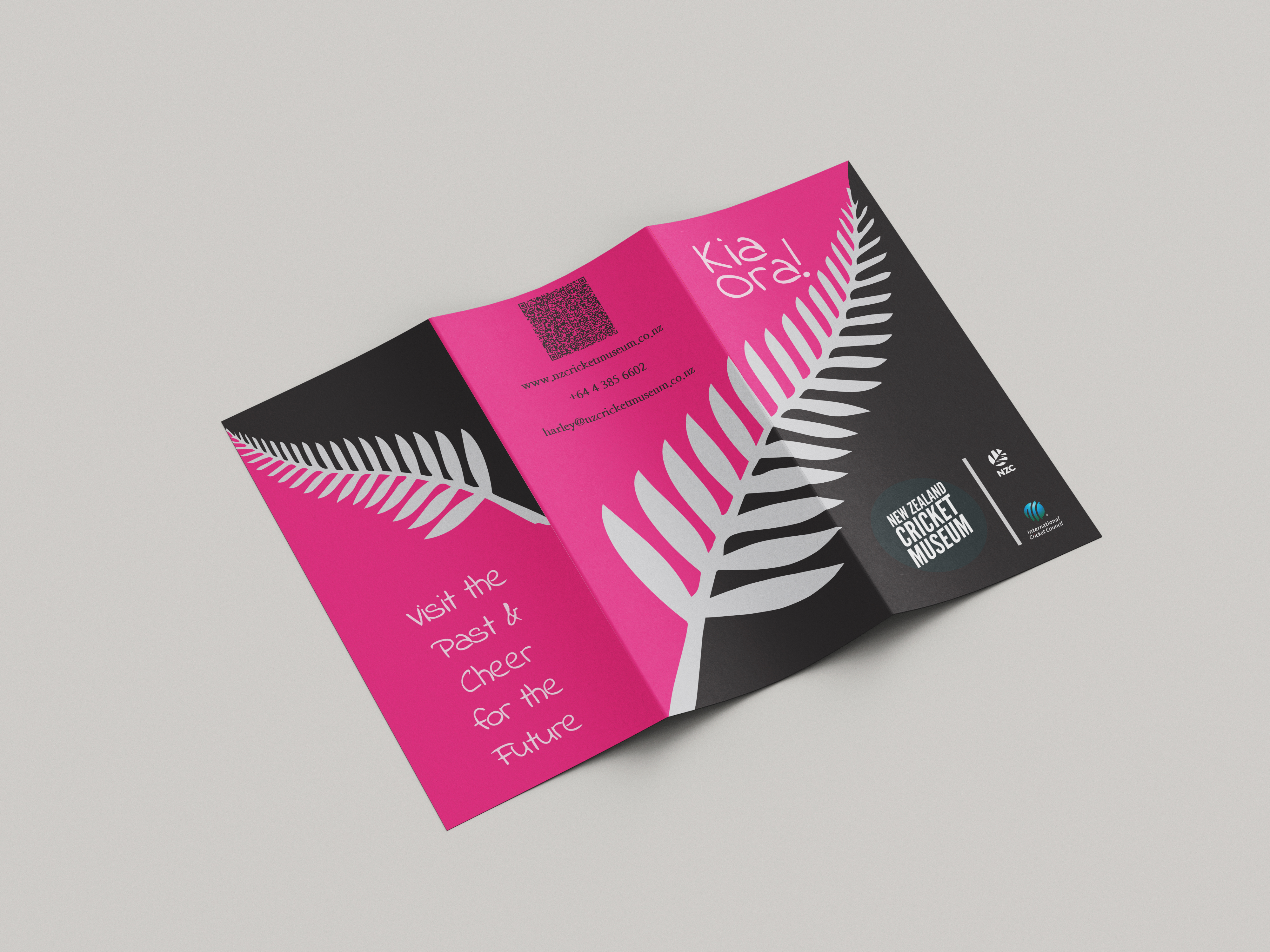
The colour palette drew from New Zealand cricket's official colours while introducing vibrant accents that added energy and accessibility. Typography choices balanced readability with personality—clean sans-serif fonts for body text ensured legibility at various sizes, while bold display faces created impact for headlines and callouts.
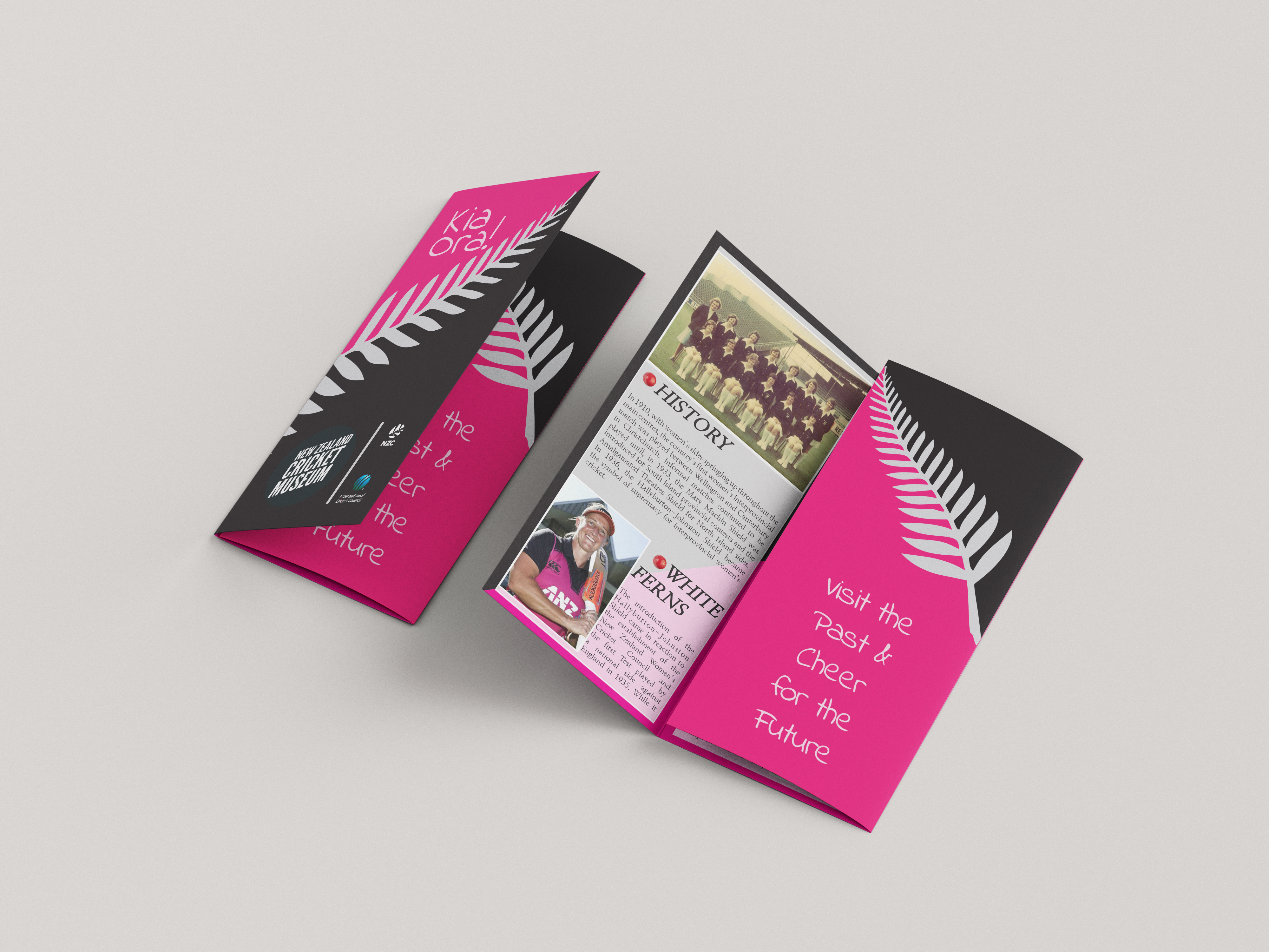
Layout design emphasised dynamic imagery of female cricketers in action, celebrating athleticism and skill. I used angular design elements and movement-inspired graphics to convey the sport's energy and excitement. Historical photographs were treated with care and prominence, giving them equal visual weight to contemporary images and reinforcing the continuity of women's cricket excellence.
Information Architecture
The brochure structure was carefully planned to guide readers through a compelling narrative while making information easily accessible. The layout progressed from historical overview to contemporary achievements, culminating in World Cup excitement and a clear call to action to visit the museum.
Key sections included a timeline of women's cricket milestones in New Zealand, profiles of legendary players, highlights of the museum's women's cricket collection, and practical World Cup information including schedules and ticketing details. Each section was designed to stand alone while contributing to the overall story.
Information hierarchy was established through varied type sizes, strategic use of white space, and visual markers that helped readers navigate the content. Pull quotes from notable players added authenticity and personal connection, while statistics and facts were presented in visually distinct callouts for quick scanning.
Print Production & Format
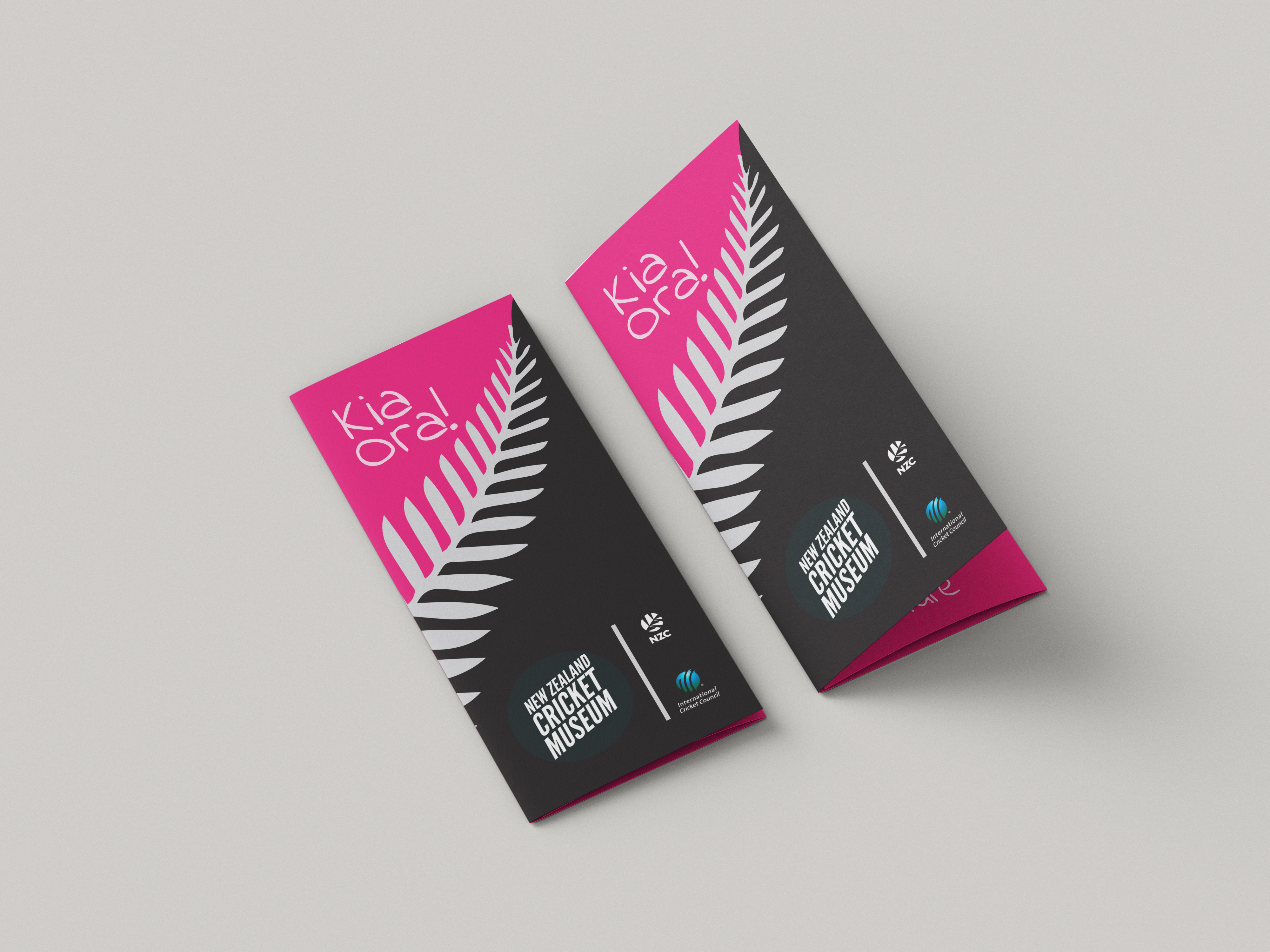
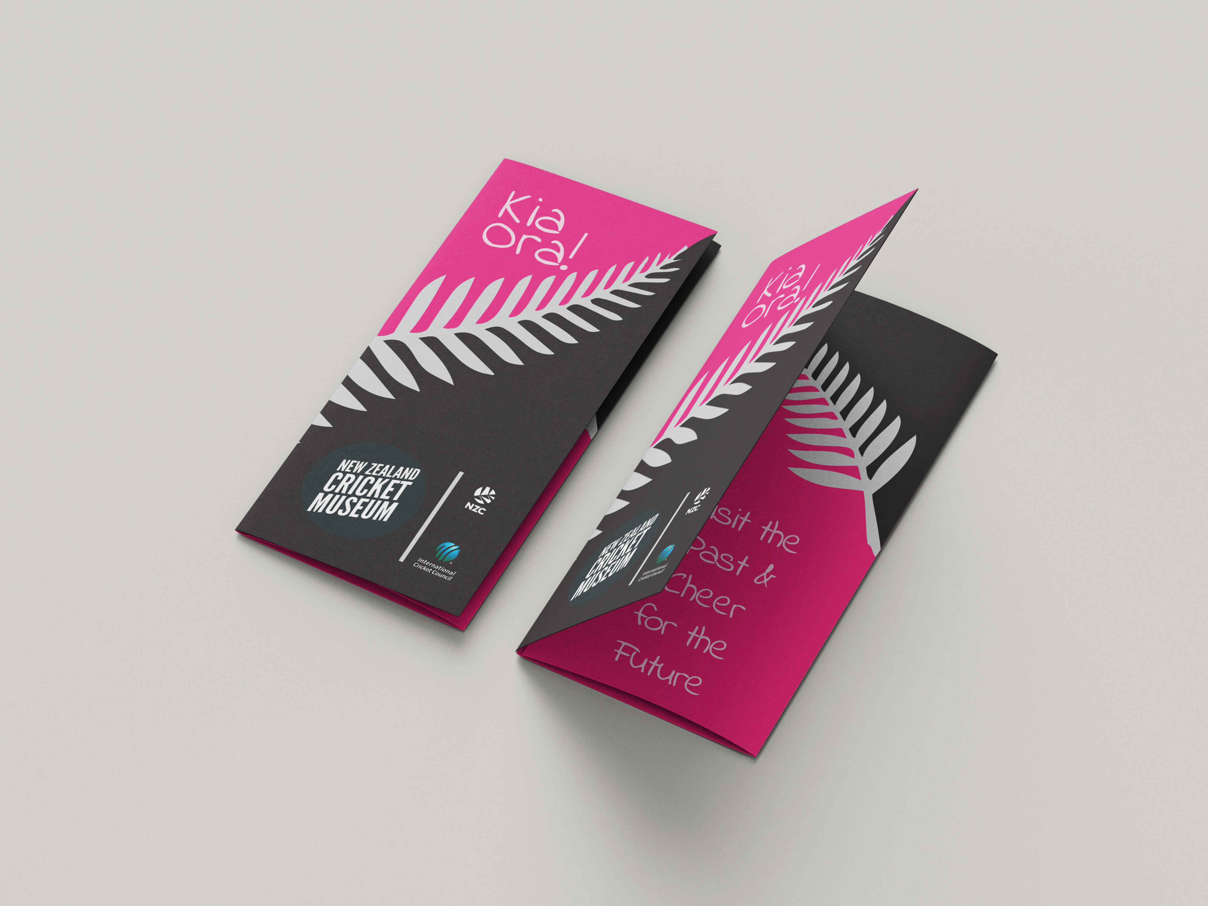
The brochure format was chosen to be practical for museum distribution while providing enough space for comprehensive storytelling. A tri-fold format allowed for logical content division and created natural reveals as readers unfolded the brochure, building engagement progressively.
Print specifications were carefully considered to ensure quality reproduction of photographs and graphics while remaining cost-effective for large print runs. Paper stock selection balanced durability with a premium feel appropriate for a cultural institution.
Production files were prepared with precise attention to bleed, trim marks, and colour management. I worked closely with printers to ensure colour accuracy, particularly for reproducing historical photographs and maintaining brand colour consistency throughout the piece.
Audience Engagement Strategy
Beyond the physical brochure, I considered how the design could facilitate broader engagement. QR codes linked to extended online content, including video interviews with players and virtual museum tours of the women's cricket collection. Social media graphics were designed in complementary styles to create a cohesive campaign.
The brochure was designed to be collectible and shareable—something visitors would want to keep and show others. Special attention was paid to creating "Instagram-worthy" moments within the design that would encourage social sharing and organic promotion.
Impact & Results
The museum visitor guide successfully contributed to increasing awareness of women's cricket history and the museum's relevant collections. The design effectively balanced educational content with promotional messaging, creating a resource that served both as an informational piece and a compelling invitation to visit.
The project demonstrated how thoughtful design can elevate underrepresented stories and make cultural content more accessible and engaging. By celebrating women's cricket achievements and connecting historical context to contemporary excitement, the brochure helped broaden the museum's appeal and relevance.
The timing with the Women's Cricket World Cup created a perfect opportunity to attract new audiences who might not have considered visiting a cricket museum previously, while also providing longtime fans with deeper appreciation for the sport's history.
Key Learnings
This project reinforced the importance of research in design work. Uncovering compelling stories and understanding the audience deeply informed every design decision, from color choices to content structure.
The experience highlighted how design can serve as a tool for social impact—in this case, increasing visibility for women's sports history and challenging gender biases in sports culture. Design choices that centered female athletes and treated their achievements with the same reverence as men's cricket history helped shift perceptions.
Finally, the project demonstrated the continued relevance of print design in a digital age. A well-designed physical brochure created a tangible connection that complemented digital efforts, providing something visitors could reference, collect, and share.